Logo + Branding Questions
This is where you tell us about your logo & brand.
From the answers to the following questions we will develop an understanding of who you are, and how to best visually present your vision with excellence. You will have the opportunity to use both words and visuals to narrow down the look and feel of your brand as well as the important purpose behind it.
Before you get started you may want to look at our pricing page to see what kind of visual package you need for your brand. This may help you answer some of the following questions more clearly.
So, as you begin, clear your mind. Clarity empowers action. These questions may take you some time to complete… because beginning is costly. Remember, your brand’s future is worth it. Let’s get started!
Resource Section
-
If your company name is more cryptic, like “Axius” or “The Imaginarium”, a tagline that describes what it is you do is a good idea. Examples: “Axius. Bringing people in the FinTech world together.” “The Imaginarium. A place for kids to become makers.” For people to have an immediate grasp of what you do is important, especially as your getting started. “Nike. Just Do It.” tells us nothing, but we already know about them. If you have a descriptive word(s) in your name “Tim’s Plumbing” or “Cut-It-Out Pet Grooming”, than your tagline is not as necessary to your brand in every visual instance, but your tagline can focus on the mission, quality, or service you specialize in. “Tim’s Plumbing. Local Service on call 24 Hours a day (or night)!” “Cut-It-Out Pet Grooming. Mats, Burrs, and Dirt are no match for our loving team of animal care experts!” (that one’s probably way too long, but you get the idea).
-
A logotype or wordmark is the name of company in a font/typeface. It may be an existing font that is customized to some degree, or it may be built from scratch. It is the “Nike” next to the Swoosh, the Coca-Cola script on the can.
A logo-mark or “mark” does not usually contain the name of the company — it is a mark such as the Shell on the gas station or the Swoop on a Nike shoe or the Apple on the back of an iPhone. It can stand alone or be incorporated with a logotype.
There may be a several types of mark/type combinations in an identity system that are used in different contexts, a mark being used for a social media profile or uniform while the logo-mark/logotype combo would be going on the letterhead or building.
-
A font is simply the software representing a typeface on a digital device. We now use the terms almost interchangeably as there is very little physical “type-setting” being done these days, and most fonts are only handled using digital tools.
-
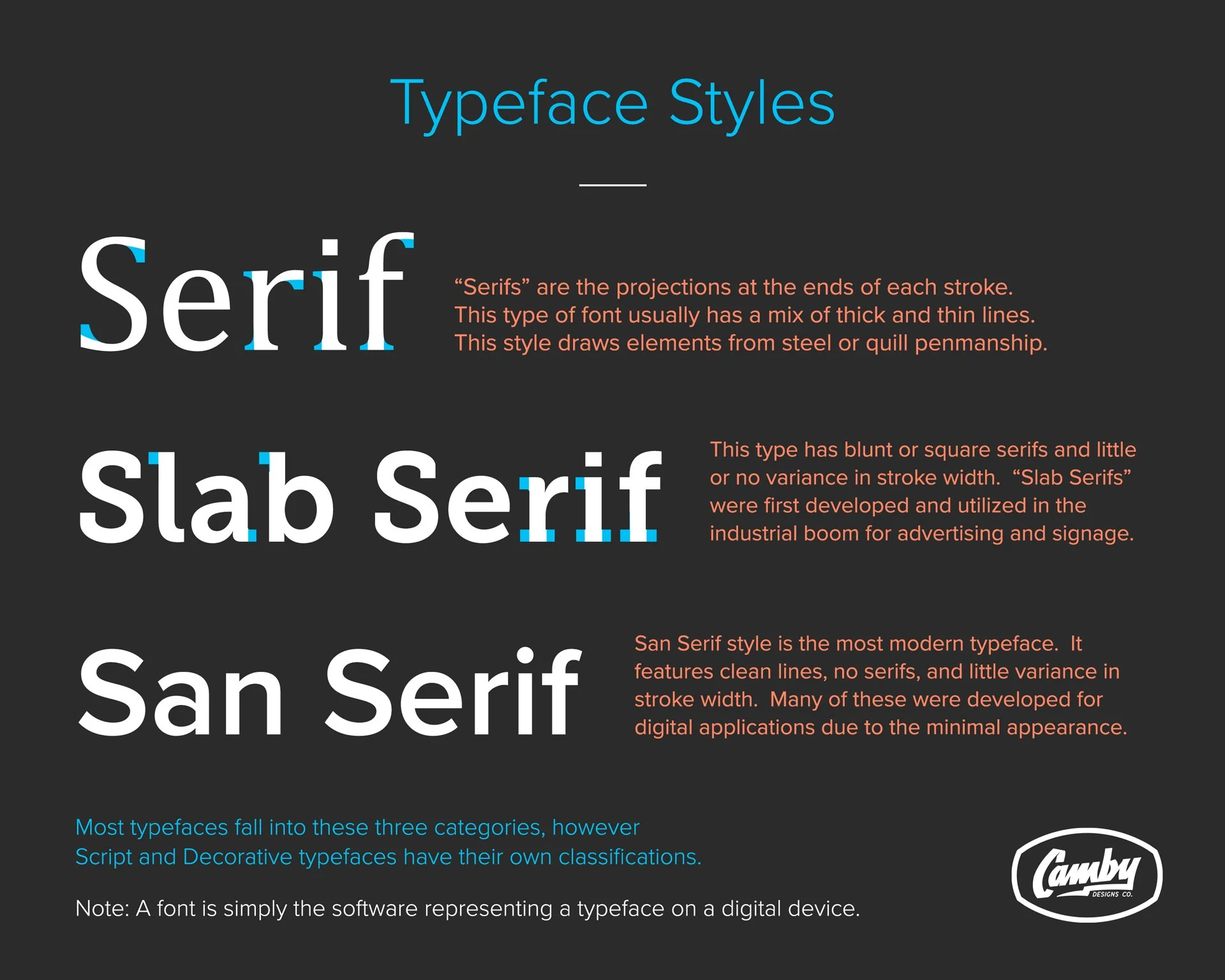
Serif: "Serifs" are the projections at the ends of each stroke. This type of font usually has a mix of thick and thin lines. This style draws elements from steel or quill penmanship.
Slab Serif: This type has blunt or square serifs and little or no variance in stroke width. "Slab Serifs" were first developed and utilized in the industrial boom for advertising and signage.
San Serif: This style is the most modern typeface. It features clean lines, no serifs, and little variance in stroke width. Many of these were developed for digital applications due to the minimal appearance.
Most typefaces fall into these three categories, however Script and Decorative typefaces have their own classifications.
See Typeface Styles Graphic below for a visual reference.
-
These categories are so broad that it is difficult to easily define script and decorative typefaces, however a few examples will help you know if this is something you are interested in.
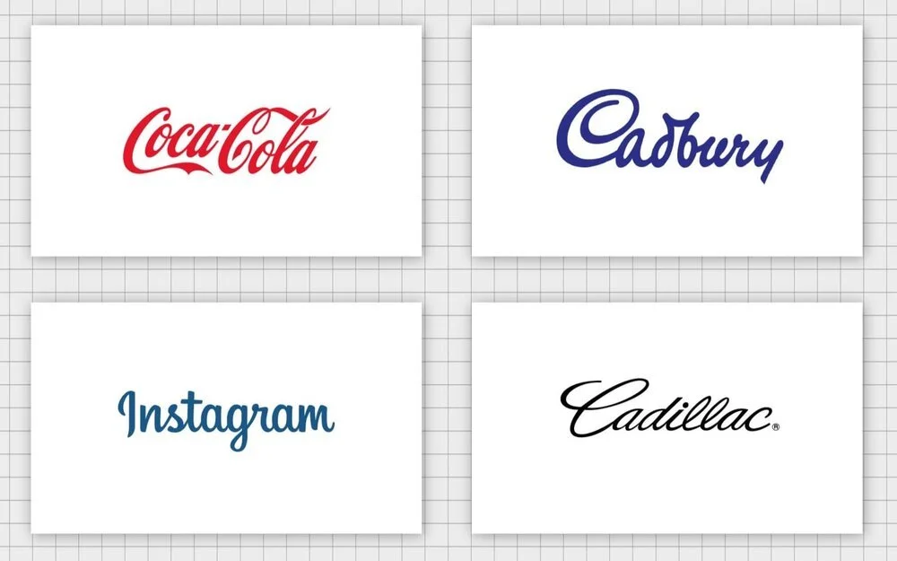
Script is usually a flowing, connected set of slanted letters that was originally based on cursive hand writing. Certain styles of modern calligraphy would be considered script, as well as more stylized versions like the famous examples below.
See the text and link below the ‘Famous Scripts’ graphic for more on Decorative and Display Typefaces.
Famous Script Typefaces
Decorative or Display Fonts are those that may fall into one or more of the aforementioned categories, but are unique and distinctive, a bonus for your brand if the style fits what you are going for. See an example of some of the current display fonts available on the website Creative Market.
Style Stacks tool
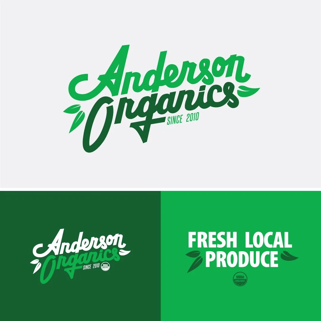
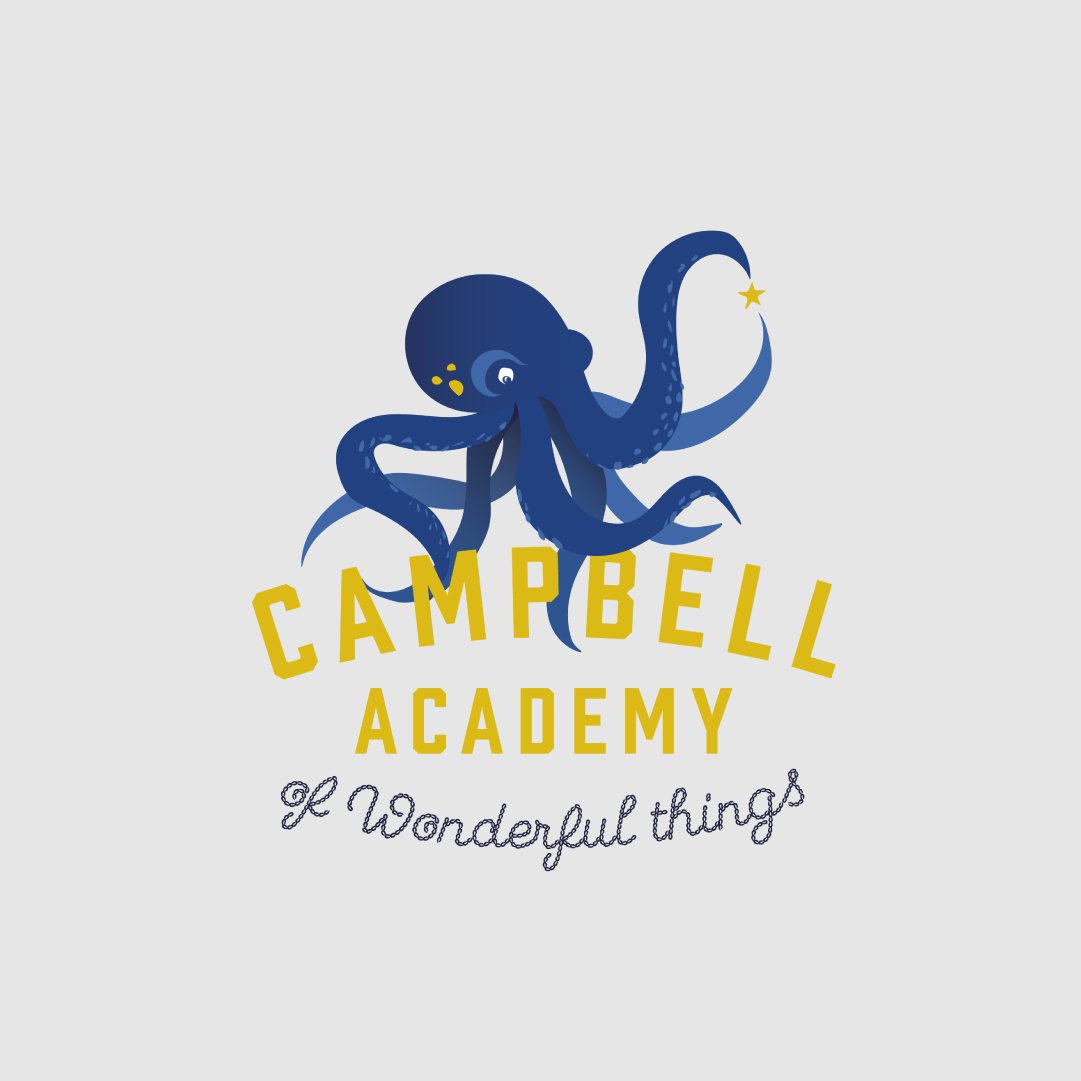
Look over the Style Stacks below to get a sense of the descriptive words used for each design:

Elaborate, Geometric, Modern, Futuristic, Illustrated

Modern, Heritage, Custom Lettering, Illustrated

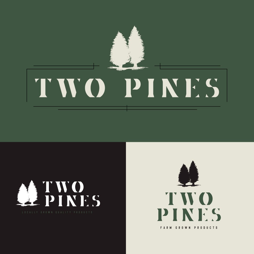
Heritage, Rough, Sketched, Custom Lettering

Clean Custom Lettering, Illustrated, Friendly, Thick

Friendly, Illustrated, Modern, Thin
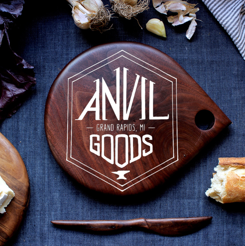
Artisan, Rough, Sketched, Custom Lettering

Geometric, Clean, Futuristic, Modern, Thick

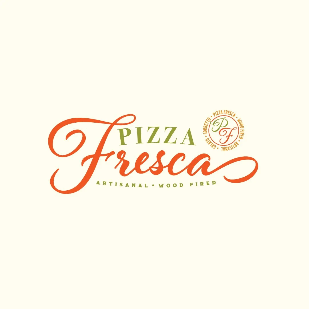
Custom Lettering, Modern, Clean, Script

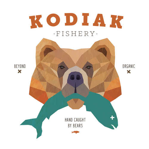
Playful, Illustrated, Friendly, Modern

Elegant, Pretty, Illustrated, Custom Lettering
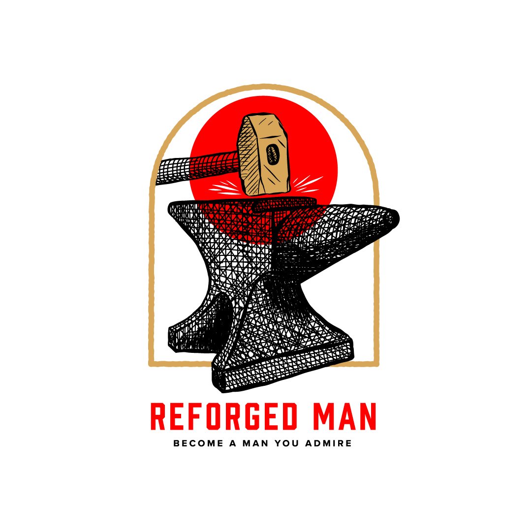
Heritage, Artisan, Illustrated, Sketched

Clean, Illustrated, Futuristic, Minimal
Visual Inspiration Tool
Pick your top three, and put the numbers in the box for Question 8 above, along with why you like these. Be as specific as possible.
Pick the three you like the least. Same drill.
1
2
3
4
5
6
7
8
9
10
11
12
13
14
15
16
17
18
19
20
21
22
23
24
25
26
27
28
29
30
31
32
33
34
35
36
37
38
39
40

